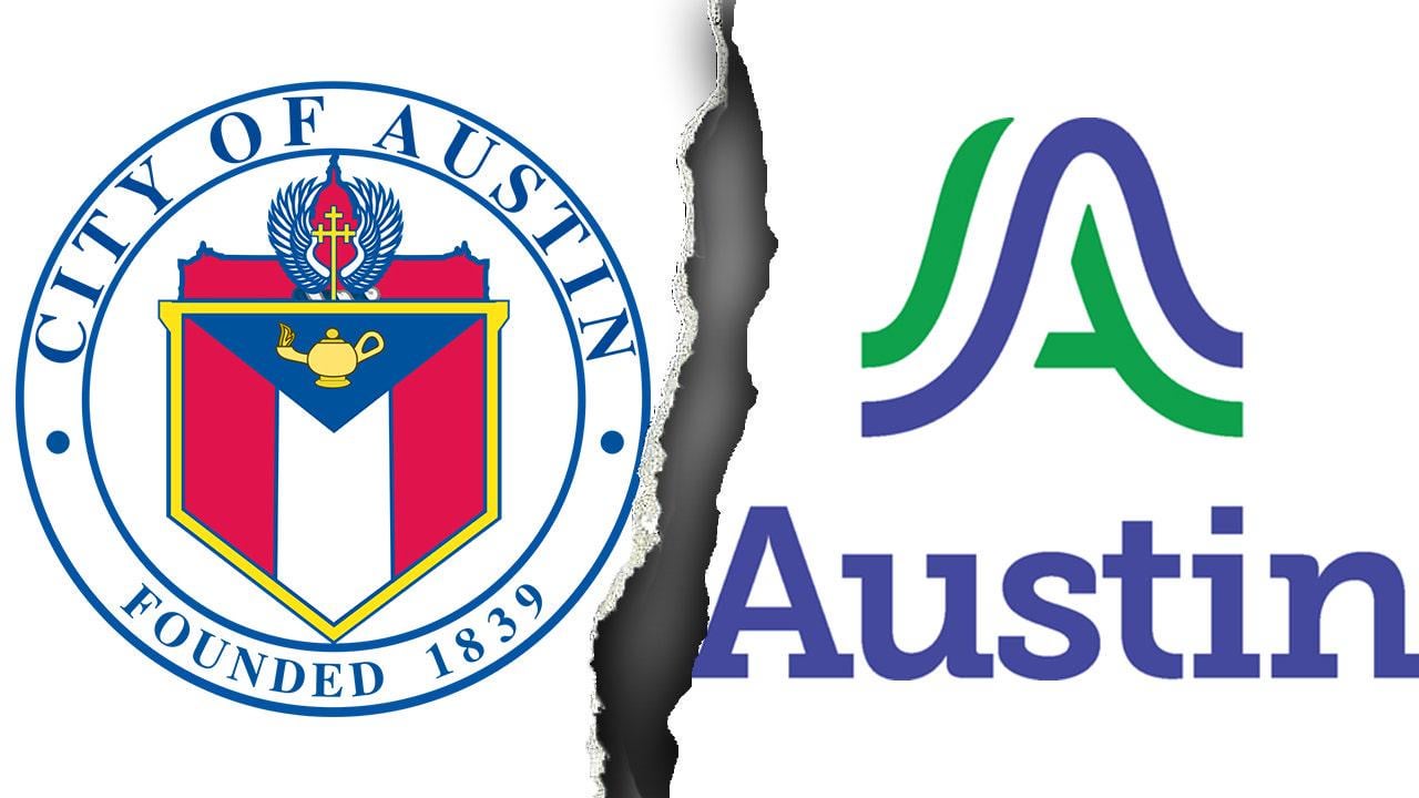
Austin unveils $1M logo redesign, congressman blasts ‘woke’ rebrand as Cracker Barrel-style flop
Posted by WillyNilly1997

Austin unveils $1M logo redesign, congressman blasts ‘woke’ rebrand as Cracker Barrel-style flop
Posted by WillyNilly1997
5 Comments
Austin trying to look like a corporation and be all trendy for the kids, I see.
I don’t get it. Other than the designer acknowledging Austin is “a little Liberal island” what exactly is woke about this? It’s stated it represents the “rivers and bridges that connects us all” and the green and blue for parks and rivers.
As a Texan myself, I’m the first to criticize woke ass Austin, but this ain’t it
Reject modernity. Embrace tradition.
New logo is much better than the old one.
It looks like a logo for Autism. I can’t explain why.