
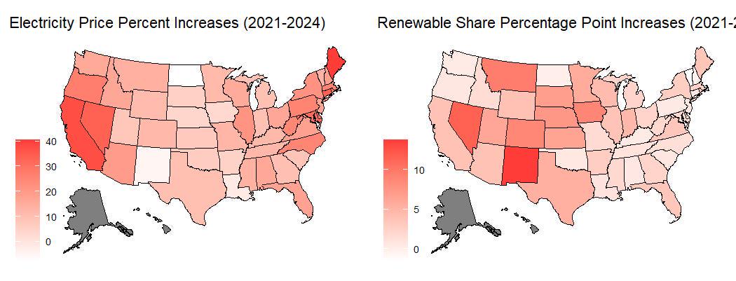
Nominal Price Increases vs. Increase in Renewable Share of Total Generation
You can read this post on substack if you prefer its formatting over reddit's.
Increasing electricity costs have been hitting the pocketbooks of Americans since 2021. Despite overall inflation being high from 2021 onward, electricity prices are outpacing it.
The current administration is blaming the growth of solar and wind power. It is acting on this hypothesis by trying to strangle the solar and wind industries by using federal permitting to block construction on both public and private land.
Supposing that were true, it is odd that real prices have only risen recently. Wind and solar have been steadily increasing in the US’s energy mix since the early 2000s, so under that assumption, prices should have increased during that entire period, not just recently.
However, given the importance of electricity prices to the economy, it is worth investigating whether states with more wind and solar energy have higher prices than other states, or if the growth of wind and solar energy within states increases prices. This is an exploratory analysis with a limited data set and isn’t meant to be the final word on the matter. However, it can give some indication of whether renewables impact prices. Given this is an informal analysis and not a scientific paper, I’ll use a relaxed significance level of 0.10, instead of the traditional 0.05.
The Data
I pulled annual average retail prices (cents per kWh) for all sectors for each state from the Energy Information Agency’s (EIA) Electricity Data Browser, along with solar, wind, and total generation (thousand MWh). I retrieved the CPI data from FRED to adjust the electricity prices to August 2025 prices. Finally, I downloaded annual average temperatures and differences from the 1901-2000 period (degrees Fahrenheit) from NOAA. I had difficulty with their API, so I had to manually download it, which is why I chose to do my analysis at the annual level. My dataset covers the period from 2018 to 2024 and, due to the NOAA data, only contains the contiguous 48 states.
In addition to adjusting electricity prices for inflation, I calculated the proportion of electricity generated by solar and wind for each state and year. I do this to normalize solar and wind generation between states. California generates more electricity than New Hampshire, and I need to be able to compare them to each other.
Next, I calculate the log-difference of total generation to include generation growth. New plants can take years to come online, so a sharp increase in total generation from the previous year can mean the current assets are stretched to their limit, and less economic units are brought online, driving up prices. This rests on the assumption that independent power producers or utilities didn’t anticipate the demand increase and weren’t able to start construction on new power plants in time to meet demand. It also ignores that grids are connected and states can import power from neighboring states.
With the discussion of the data set over, it’s time to proceed to the analysis, starting with the variation between states.
Cross-Sectional Analysis
The scatter plot of log-prices vs. solar as a proportion of total generation doesn’t show a clear relationship. There are states with low prices that have low solar generation, and others with high solar generation. The reverse is true as well. There is a pattern in the plot of log-prices vs. wind that shows states with high prices tend to have lower wind generation, but the relationship isn’t neatly linear. The states with the highest share of wind generation are Iowa, South Dakota, Kansas, and Oklahoma. Not exactly blue states. They have a lot of open flat land and a lot of wind, so the fact that they have lower prices than average doesn’t mean states with different geographies and climates can copy their energy mix. Moving on to the non-renewable variables.
Again, there doesn’t appear to be a clear relationship between log-prices and average annual temperatures. Ignoring 2019, there does appear to be a positive relationship for the degrees above the 1901-2000 baseline. There does not appear to be a relationship between log-generation growth and log-prices (Note: I lost the year 2018 in this analysis due to calculating the log-difference of generation).
While the scatter plots offer some visual clues, they aren’t conclusive. To more rigorously assess whether renewables explain variation in prices between states, I used a Between Effects model, which averages the values of each variable for each state and performs OLS regression. Due to the time it takes to bring solar and wind farms online, I think it is unlikely that high prices at time t lead to more solar and wind being built at time t, so I don’t think endogeneity) is a concern here, unless averaging the time-steps together reintroduces it. I am concerned that this model doesn’t account for fixed effects within states, but I want to see if there is evidence of renewables driving price differences between states. With those caveats, here is the regression output.
Only the coefficient for degrees (F) above baseline is significant, which makes sense. A hotter-than-average year will see more AC usage, which increases electricity demand, which increases prices. The model explains 66% of the variation in log-prices between states. It is unusual to get such a high R-squared with only one significant variable, although extreme weather, both hot and cold, certainly drives energy demand.
The residual vs. fitted plot shows a U pattern, which is not indicative of a good model. Although I do buy that a state having a warmer-than-average year will lead to higher prices compared to a state experiencing a moderate year, I don’t trust the coefficient estimate. It is possible I’ve chosen a poor functional form, but I think omitted variable bias is a big issue with this model.
I’m not accounting for the differences in customer mix (industrial vs. residential, urbanized vs. rural), market structure (regulated utility vs. deregulated market), or the overall fuel mix. These state-level differences don’t change much year to year. To control for these unobserved, time-invariant factors, I next ran a within-state analysis using an Arellano-Bond model.
Within-State Analysis
In this section, I examine the impact of increasing the share of renewables on prices within a state. I used an Arellano-Bond model to account for state-specific effects through differencing and lagged values of solar and wind as a proportion of total generation as instruments to address endogeneity. The value of the average temperature and the average temperature from baseline are the same when differenced, so I drop one.
The results from the Sargan Test and autocorrelation checks suggest that the lagged values of solar and wind pass the necessary tests for instrument validity, meaning they plausibly control for endogeneity. Given that, all my model shows is that prior prices are predictive of current prices. It is possible that the effects on prices take more than a year to appear, or the variation from year to year is too small to cause a detectable difference. That being said, there is no evidence of an effect of solar and wind on prices a year ahead.
The residuals from this model are better behaved than those from the between-states model. So I have that going for me, which is nice.
I failed to find a connection between solar and wind’s shares of total generation and prices. That doesn’t mean there isn’t one. From a Construction Physics post on the topic:
It is possible that my methods and data granularity fail to pick up on the effects of renewables on congestion prices. That caveat aside, I don’t see any evidence to support the Trump administration’s campaign against renewables.
Other Explanations
A part of the explanation likely has to do with natural gas prices, which rose from 2021 through 2022. Although the gas market is not as globally integrated as the oil market, the Russian invasion of Ukraine in 2022 sharply increased American natural gas prices as well as European prices, as it raised uncertainty and led people to seek alternatives to Russian gas.
But that likely only explains a portion of what happened to electricity prices. The extreme weather we’ve experienced over the last several years may play a part. Cold winters can spike electricity prices because electricity producers have to buy gas at the same time people rush to use it for heating. Record-breaking heat waves increase air-conditioning usage, driving up prices.
Rising demand due to increased electrification (e.g., electric vehicles) and, of course, data centers is probably part of the story. Demand rising faster than supply growth can lead to less cost-efficient generators being brought online. In deregulated markets, the marginal cost of production sets the price, resulting in higher prices. In regulated markets, that means higher fuel costs, which are passed to consumers.
A more thorough analysis will need to factor those in, as well as take a more granular level of observation than state and year-level analysis. But I doubt a more thorough analysis will reveal solar and wind to be a significant driver of price increases.
I believe the Trump administration’s energy policy is built on a faulty premise. Undermining renewables won’t bring costs down; it may do the opposite as the government limits the tools the US can use to meet its energy demand. That is the opposite of Energy Dominance.
Posted by MensesFiatbug
1 Comment
!ping GET-LIT