
A friend made a website, invented an index and I wonder that if it is actually a signal or total nonsense?
So I fell down a weird rabbit hole and ended up on this thing called doomchart.com.
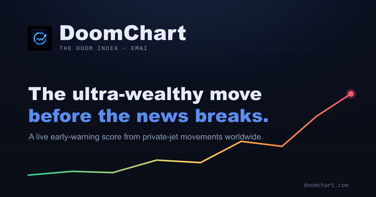
The whole claim is that rich people and politics supposedly know when something bad is coming before the layman, and the first thing they do is get on their private jets and leave. So the site pulls live flight-tracking data (ADS-B, the same stuff normal plane trackers use), watches global business-jet departures, and compares them to the historical average for that exact day and time. If departures spike way above normal, it bumps an "alert level" up a 1-to-5 scale. 5 is basically "the elites are fleeing, good luck."
Here's where I'm torn. On one hand, "follow the money / follow the jets" isn't a crazy instinct. (Needs to be tested with real case). People with resources do move early. On the other hand, this feels like textbook apophenia — take any noisy dataset, draw a scary line on it, and our brains will happily connect it to the apocalypse.
So I'm genuinely asking:
- Is there any real correlation between private jet surges and actual crises, or is this just a vibe with a dashboard?
- Wouldn't normal stuff (Davos, F1 weekends, Thanksgiving, the Super Bowl) constantly trigger false alarms?
- Has anyone checked whether it spiked before any actual recent event, or is that just hindsight?
- Is this a clever bit of data art that looks prophetic, or is there an actual signal buried in there?
What do you think?
Posted by zamanusta