
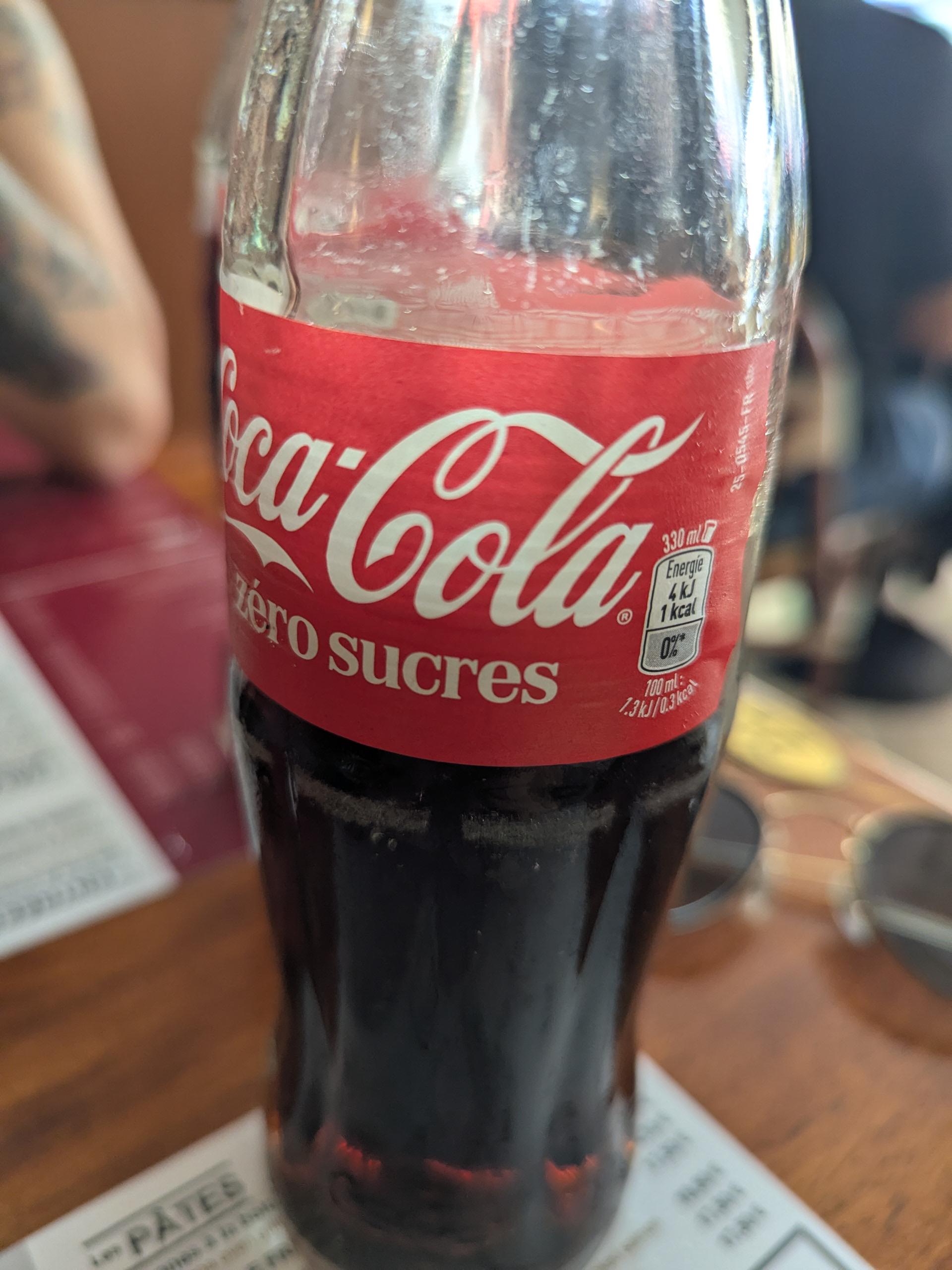
It used to be that coke was easy to identify – white font for sugar one, black for zero. This summer they switched to white font for zero, so that people at restaurants or doing groceries confuse the two and start drinking/opening more non zero coke.
Posted by Wizard-of-pause
2 Comments
Why? it costs the same. Theyre prolly switching to a model where theyll sell more zero than regular as sugar is destroying people’s health and the public is dropping sodas in favor of zero sugar drinks
That would just be robbing Peter to pay Paul though. Would make more sense if they changed the label to blue to take business away from Pepsi. Either way, they’re all poison.